
Trailpad is a controller input reader for streamers and content creators that installs in seconds, and transforms as fast as you can type.If you enjoy using Trailpad, consider donating!
Adding Trailpad to OBS
1. Add a Browser source to your scene.2. Enter this as the URL:
https://chrisdejoya.github.io/Trailpad/beta3. That's it!Tip: Set your controller to XInput/PC mode for best compatibility with OBS.
Editing Mode

Right-click on Trailpad inside of your scene and select Interact to start customizing.
USING PRESETS
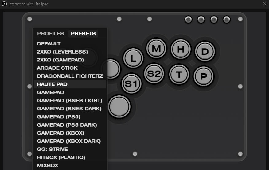
Inside of Interact mode, right-click on the canvas to open the Presets browser and select one from the list.If you'd like to see certain presets added, you can send a request here.
Shortcut Keys
| Tab | Quick help |
| F1 to F8 | Load profile |
| Ctrl F1 to F8 | Save profile |
| Ctrl-O | Load layout from file |
| Ctrl-C | Copy layout ro clipboard |
| Left click | Select Object |
| Up/Down/Left/Right | Move selected object |
| Shift Up/Down/Left/Right | Adjust size of selected object |
| Ctrl [] | Increase/decrease font/symbol size |
| [] | Increase/decrease corner roundness |
| Double click | Edit button label |
| Right click on button | Edit colors/symbols |
| Right click on canvas | Profile/Preset browser menu |
| Delete | Hide selected object |
| Home | Unhide all objects |
| Ctrl-T | Snap all objects to grid |
| Ctrl-R | Reset to default layout |
Profile Hot Swapping
You can save and load up to 8 layout profiles.
| F1 to F8 | Load Layout |
| Ctrl+F1 to Ctrl+F8 | Save Layout |
Save and Load Layouts Files
From the Interact browser, pressing Ctrl-C will copy the current layout to the clipboard. Paste it into a text file with the .json extension.To load a layout from a .json, press Ctrl-O and select a layout.Note: Saving/copying and loading layouts currently isn't available in Streamlabs due to how the browser sandbox works.
Useful CSS References
For advanced users, everything in Trailpad can be customized using Custom CSS to truly make it your own.Additionally, go beyond CSS and try applying Filters. Trailpad works great with them.
| Joystick Head | .joystickHead { *Insert properties here* } |
| Color Trail | :root { --trail-color: #*yourcolor* !important } |
| A Button | .btn[data-btn="A"] { *Insert properties here* } |
| Up Button | .btn[data-btn="Up"] { *Insert properties here* } |
| Down Button | .btn[data-btn="Down"] { *Insert properties here* } |
| Left Button | .btn[data-btn="Left"] { *Insert properties here* } |
| Right Button | .btn[data-btn="Right"] { *Insert properties here* } |
| B Button | .btn[data-btn="B"] { *Insert properties here* } |
| X Button | .btn[data-btn="X"] { *Insert properties here* } |
| Y Button | .btn[data-btn="Y"] { *Insert properties here* } |
| LB Button | .btn[data-btn="LB"] { *Insert properties here* } |
| RB Button | .btn[data-btn="RB"] { *Insert properties here* } |
| LT Button | .btn[data-btn="LT"] { *Insert properties here* } |
| RT Button | .btn[data-btn="RT"] { *Insert properties here* } |
| LS Button | .btn[data-btn="LS"] { *Insert properties here* } |
| RS Button | .btn[data-btn="RS"] { *Insert properties here* } |
| View Button | .btn[data-btn="View"] { *Insert properties here* } |
| Menu Button | .btn[data-btn="Menu"] { *Insert properties here* } |
Feature Roadmap
Select and Edit Multiple Objects
Joystick, gate and arrow picker
Trail color picker
Font selector
Programmable buttons
Steering wheel
Local server
Multiple profile support
Multiple controller support
Trailpad is free to use. Kindly respect my rights as a creator!
